Visualization Element: Table
Symbol:

Category: Common Controls
The element displays data that can be represented as an array in a table. Therefore, the data type of the visualizing variable can be 1) a one-dimensional array, 2) a maximum two-dimensional array, 3) an array of an array, 4) an array of structures, or 5) an array of a function block.
Element properties
Are all element properties available?
All properties are available only after you select the Advanced option or the All categories filter in Properties.
Element name | Example: Name assignmentAssign individual names for elements so that they are found faster in the element list. |
Type of element | Table |
Data array | Array whose data is visualized as a table Variable ( . Array types
Example: Declaration: TipIf the declaration of the array changes, then the table can be refreshed by placing the cursor in the data array value field and pressing the Enter key. |
Maximum array index | Top index limit for the displayed table. Limits the number of displayed rows. The index begins at
TipThe number of entries in the table can be set dynamically using the The index starts at |
Columns
The Table element displays the values of a variable in a tabular view. The array elements of structure members are shown in a column or in a row. Two-dimensional arrays or arrays of a structure are shown in multiple columns. The visualized variable is defined in the Data array property. When a variable is assigned there, you can specify the display of the table columns where the array elements are shown. An individual configuration is possible for each column that is assigned to an index n.
Column header | By default, the name of the array or structure is applied as the heading with the index or structure member for the column. If an array of a function block has been selected for Data array, then the name of the array is applied to the column header with the local variables of the function block that belong to the column. The column label can be changed here by specifying a new title. |
Width | Column width (in pixels) |
Image column |
|
Image configuration | |
Fill mode |
|
Transparency |
|
Transparent color | This color is displayed as transparent. Requirement: The Transparency property is activated. |
Text alignment of header | . Alignment of the column header:
|
Use template |
Use case: In order to process user input (for example, clicking in a cell), this cell must have an input configuration. This is possible when the Use template option is activated. The Input configuration property is then available and a follow-up action can be configured for a mouse event. Example: When a user clicks on the cell configured in this way in the running visualization, the Boolean variable assigned to the cell is toggled. |
Text alignment of the headline from the template |
|
Template | When the Use template property is activated, this property is visible and all properties of a rectangle are available below it. TipThese properties and their configurable options are described in the help for the Rectangle, Rounded Rectangle, Ellipse element. |


Show row header |
Example: For an array, the index of the array element is displayed in the header. |
Show column header |
|
Row height | Height of the rows (in pixels) |
Row header width | Width of the row label |
Scroll bar size | Size of the scroll bar (in pixels) |
Position
The position defines the location and size of the element in the visualization window. This is based on the Cartesian coordinate system. The origin is located in the upper left corner of the window. The positive horizontal X-axis runs to the right. The positive vertical Y-axis runs downwards.
X | The X-coordinate (in pixels) of the upper left corner of the element Example: |
Y | The Y-coordinate (in pixels) of the upper left corner of the element Example: |
Width | Specified in pixels Example: |
Height | Specified in pixels Example: |
Tip
You can change the values by dragging the box  symbols to other positions in the editor.
Text properties
The properties get fixed values for the text properties and act on the texts configured in or .
Horizontal alignment | Horizontal alignment of the text within the element |
Vertical alignment | Vertical alignment of the text within the element |
Text format | . Definition for displaying texts that are too long
|
Font | Example: Default
|
Font color | Example: Black
|
Transparency | Integer (value range from The transparent value determines the transparency of the respective color.
Read-only transparencyThe property is read-only when the color is a style color with a predefined transparency value. |


Dynamic texts
Dynamic texts are variably indexed texts of a text list. At runtime, the text is displayed that is currently indexed in the variable.
Text List | . Name of the text list
Note: If a text list from the project is transferred to a visualization in a library, then a dot has to be prepended to the name of the text list. |
Text index | . Text list ID which refers to the desired output text
|
Tooltip index | . Text list ID which refers to the desired output text
|
Font variables
The variables allow for dynamic control of the text display.
Font name | Variable ( Example: The selection of fonts corresponds to the default Font dialog. |
Size | Variable (integer data type) for the font size (in pixels) Example: The selection of font sizes corresponds to the default Font dialog. |
Flags | Variable ( . Flags:
NoteYou can combine the font displays by adding the coding of the flags. For example, a bold and underlined text: |
Font | Variable ( The selection of character set numbers corresponds to the Script setting of the standard Font dialog. |
Color | Variable ( Example: |
Flags for text alignment | Variable (integer data type) for coding the text alignment Example: . Coding:
NoteYou can combine the text alignments by adding the coding of the flags. For example, a vertical and horizontal centered text: |
Tip
Fixed values for displaying texts are set in Text properties.
State variables
The variables control the element behavior dynamically.
Invisible | Variable (
Example: |
Deactivate inputs | Variable (
|
Tip
The Invisible property is supported by the "Client Animation" functionality.
Selection
Selection color | Fill color of the selected row |
Selection font color | Font color of the selected row |
Frame selection type | . Selection when clicking the table row.
|
Frame around selected cells |
|
Variable for selected column | Variable ( If the data array points to a structure, then the structure members are indexed, starting at 0. WarningThis index represents the correct position in the array only if no columns have been removed from the table in the display. |
Variable for selected row | Variable ( |
Variable for valid column selection | Variable (
|
Variable for valid row selection | Variable (
|
Center
The properties contain fixed values for the coordinates of the point of rotation. The rotation point is displayed in the editor as the  symbol and is used as the center for rotation and scaling.
Tip
You can also change the values by dragging the symbol to another position in the editor.
X | Editable X-coordinate of the point of rotation Double-clicking in the value field will open the line editor. |
Y | Editable Y-coordinate of the point of rotation Double-clicking in the value field will open the line editor. |
Absolute movement
The properties can be assigned to IEC variables for controlling the position of the element dynamically. The reference point is the upper left corner of the element. At runtime, the entire element is moved.
Movement | ||
X |
Increasing this value at runtime moves the element to the right. | |
Y |
Increasing this value at runtime moves the element downwards. | |
Rotation | Variable (numeric data type) for the angle of rotation (in degrees) Example: The midpoint of the element rotates at the Center point. This rotation point is shown as the At runtime, the alignment of the element remains the same with respect to the coordinate system of the visualization. Increasing the value rotates the element to the right. | 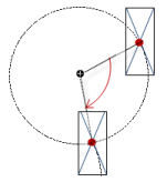 |
Interior rotation | Variable (numeric data type) for the angle of rotation (in degrees) Example: At runtime, the element rotates about the point of rotation specified in Center according to the value of the variable. In addition, the alignment of the element rotates according to the coordinate system of the visualization. Increasing the value in the code rotates clockwise. The rotation point is shown as the NoteIf a static angle of rotation is specified in the property, then the static angle of rotation is added to the variable angle of rotation (offset) when the visualization is executed. | 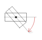 |
Tip
You can combine the variables to a Unit conversion.
Tip
The X, Y, Rotation, and Interior rotation properties are supported by the "Client Animation" functionality.
Animation
Tip
These properties are available only when you have selected the Support client animations and overlay of native elements option in the Visualization Manager.
Animation duration | Variable for the duration (in milliseconds) in which the element runs an animation
. Animatable properties
The animated movement is executed when at least one value of an animatable property has changed. The movement then executed is not jerky, but is smooth within the specified animation duration. The visualization element travels to the specified position while rotating dynamically. The transitions are smooth. |
Move to foreground | Variable (
Example: |
Permissions
Note
Available only when a user management is set up for visualization.
Access Rights button | Opens the Access Rights dialog. There you can edit the access privileges for the element. . Status messages:
|